Heat Map Time
Based on Brian’s suggestion, I decided to incorporate some heat map charts to demonstrate the changes in noise complaints received between March 1 to May 31 from 2019 to 2020. To do this, I imported the relevant data into Excel and used the Insert > Maps > Filled Map option to create a heat map based on zip codes in question. I chose to use three-color filling in order to emphasize the difference between low, medium, and high levels of noise complaints.
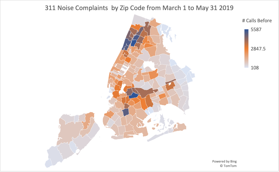
First, I created a map showing the density of noise complaints in each zip code in the 2019 period.
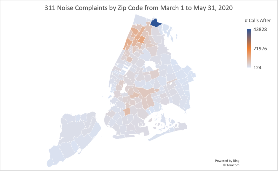
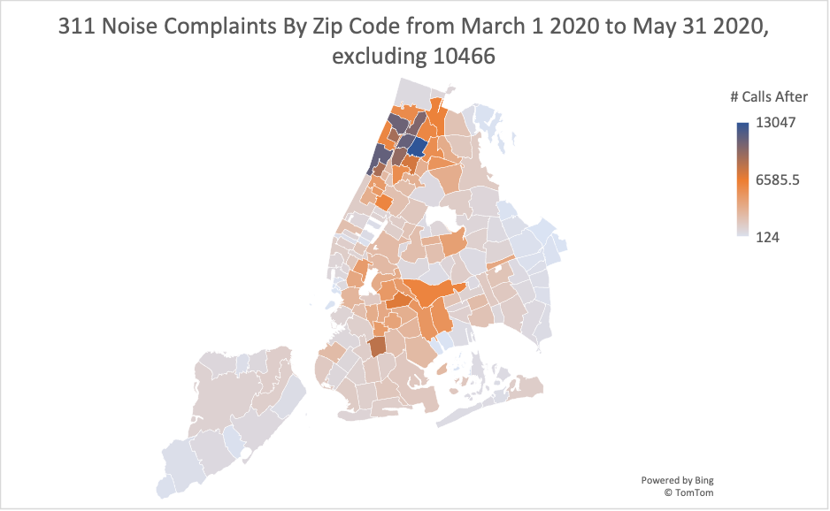
Next, I created two maps showing the density of noise complaints in each zip code in the 2020 period. My first map includes all of the zip codes I was testing, but because the 10466 zip code is such a strong outlier, I had to create a second heat map excluding it to show the true variation in values for all the other zip codes.
Below is the map with all zip codes, including 10466.
And here is the map which excludes 10466.
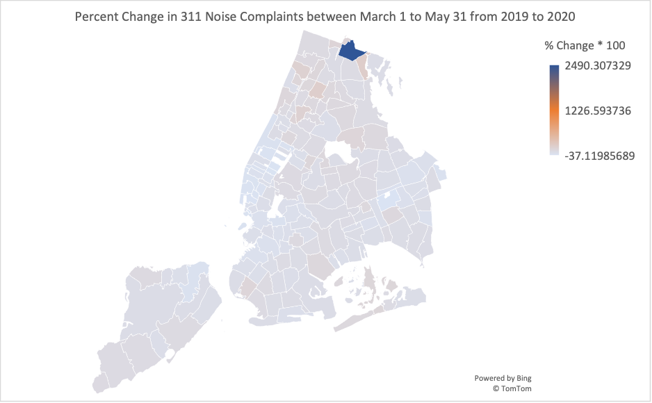
Finally, I wanted to create a map that shows the percent change in noise complaint frequency between the two periods in order to best show which areas experienced the largest changes in noise complaints over the pandemic. Similarly to the previous graphs, I had to make two versions—one including all zip codes and one excluding zip code 10466.
Below is the map with all zip codes, including 10466.
And here is the map which excludes 10466.
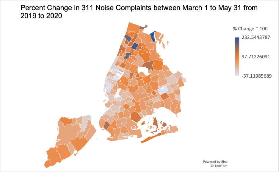
This final map is my favorite one of the ones I created because I think it best demonstrates the impact of the pandemic on noise complaints. The first thing I notice looking at the graph is that many areas experienced a significant increase in noise complaints during the beginning of the pandemic. Many areas on the map, including the Bronx, Upper Manhattan and South Brooklyn experience very high levels of noise complaints. These large amounts of noise likely led to decreased quality of life during this period when people were quarantining indoors for long periods.
Additionally, most of the map is some shade of orange or dark blue, illustrating that most regions of New York City experienced increases in noise complaints. This demonstrates that changes in noise levels were not limited to a single neighborhood or borough, and instead swept across the city. Finally, it’s also interesting to note the few areas which experienced a decrease in noise complaints. From the heat map, it appears that parts of downtown and midtown Manhattan experienced decreases in noise levels, likely due to the sharp decline in tourism in New York City during the beginning of the pandemic. However, this decrease largely was found on the west side of Manhattan while the east side experienced some increases in noise. Checking a map, it appears that there are some hospitals there, so that could be part of the issue.
Also, I wanted to check out the dates in this dataset with the most noise complaints. I added a new column in order to aggregate the data by date and looked at the 50 dates with the most 311 noise complaints and found the following
- 48/50 of the dates with most noise complaints were in May to September (with the remaining two in October)
- All of the top 5 noisiest dates were in 2020
- 25/50 of the dates with most noise complaints were in 2020
- 14/50 of the dates with most noise complaints were in 2021
- 11/50 of the dates with most noise complaints were in 2022
- 0/50 of the dates with most noise complaints were in 2018 or 2019